A few years ago, the still shiny-and-new Indianapolis International Airport (IND) found itself at the center of a mild controversy. The Airport Authority announced, after just three years in operation, what for some people amounted to a pretty significant concession: it was replacing one of the most prominent artistic installations with a large flat screen filled with animated clips of information on sponsors. In other words, it was creating a huge digital billboard, reneging on some the initial promises it made with regards to public art, in the eyes of many.
Multiple media sources, from Indianapolis Business Journal and the Star to the innovative (but apparently inactive) Minnesota-based blog Out of Home Out of Control covered this decision, in which James Wille Faust’s expansive sculptural painting Chrysalis greeted newly arrived passengers as it perched above the escalators leading down to the baggage claim. As a compromise, the new LED video wall that replaced Chrysalis in late 2011 (curated by the Indianapolis Museum of Art) would assimilate video-based artistic displays along with more conventional advertisements. Among the first programs, according to the IBJ, was a video called Permanent Press: The American Cycle by local artist Artur Silva, would comprise about one minute of the video’s full cycle—enough that for some people, it would comprise the entirety of what they see while descending to baggage claim via the escalator.
Like just about any prominent artistic installation, Chrysalis was not universally loved. But virtually everyone saw the Authority’s decision as tantamount to a degrading of the new airport’s original integrity, since Chrysalis was among the most prominent of many different installations, and, according to Faust, was intended to remain at this spot in the airport for at least a decade. But after the August announcement of the switcheroo, Chrysalis was removed by the end of November 2011.
The LED video wall installation may have been the highest profile commercialization of the airport’s interior, but it’s hardly an isolated incident. Take a trip to IND as 2014 winds down, and see for yourself.
 Â Â
  
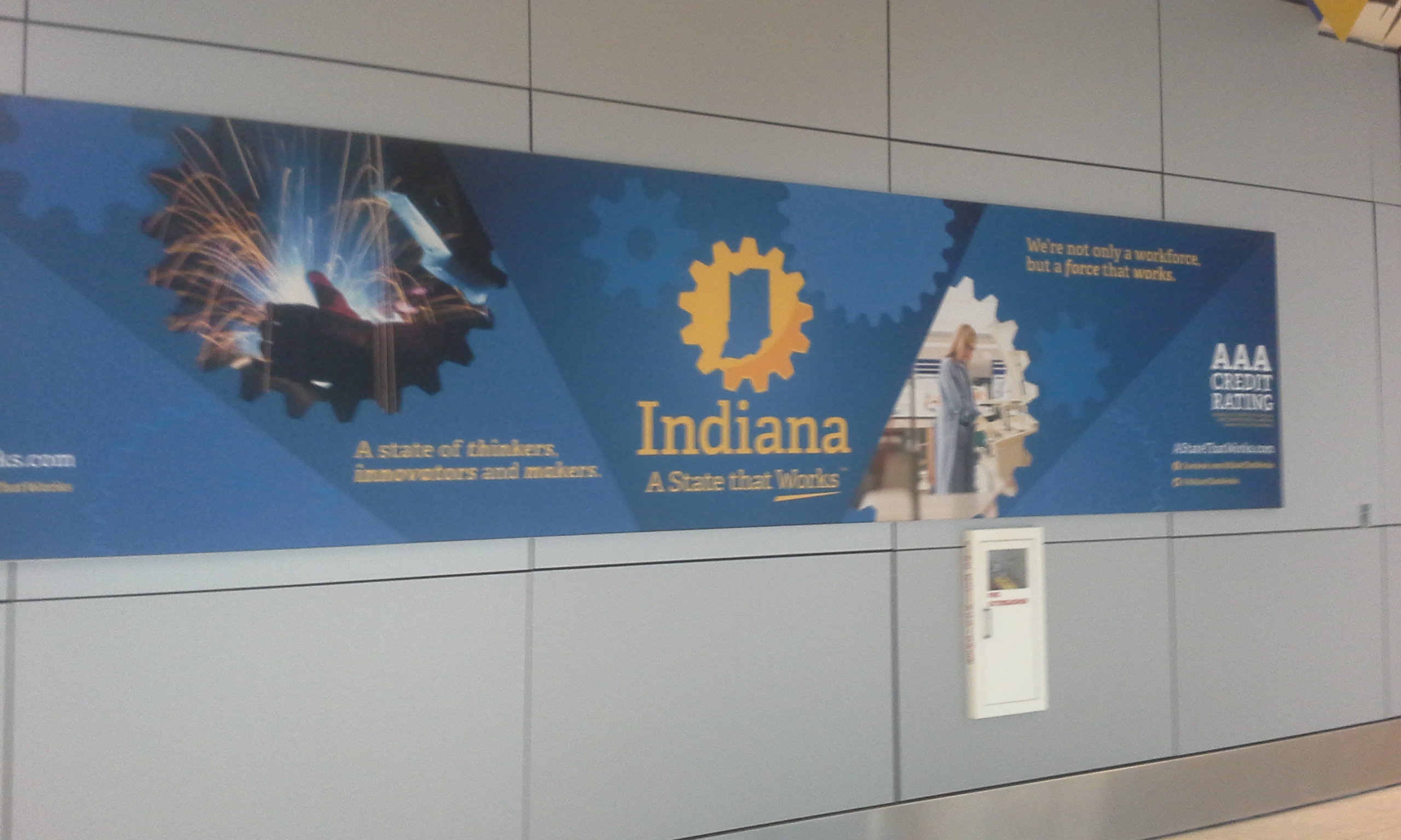


Whether suspended from the ceiling, mounted to a wall, backlit, or protruding as a flat-screen from the baggage carousel, they’re everywhere. Even spaces that might seem too irregular or oblong still seem to support promotional banners.


But my votes for the most creative installations are the custom-fit signs perched above the directional indicators for various gates.

You can’t help but look at them, even if they don’t register in the conscious.


To be fair, the Airport Authority has retained a considerable amount of the public art it promised to incorporate when it opened. While Chrysalis was probably the highest profile installation, several others drew considerable attention for their subtlety and suitability.
In many cases—not surprisingly—the art and the ads are within just a few feet of one another.

But then, in some instances, the ads are equally close to the respective retailer.

For example, Enroute Spa (featured in the lower right panel in the photograph above) has its storefront counterpart on the opposite side of concourse’s hallway.

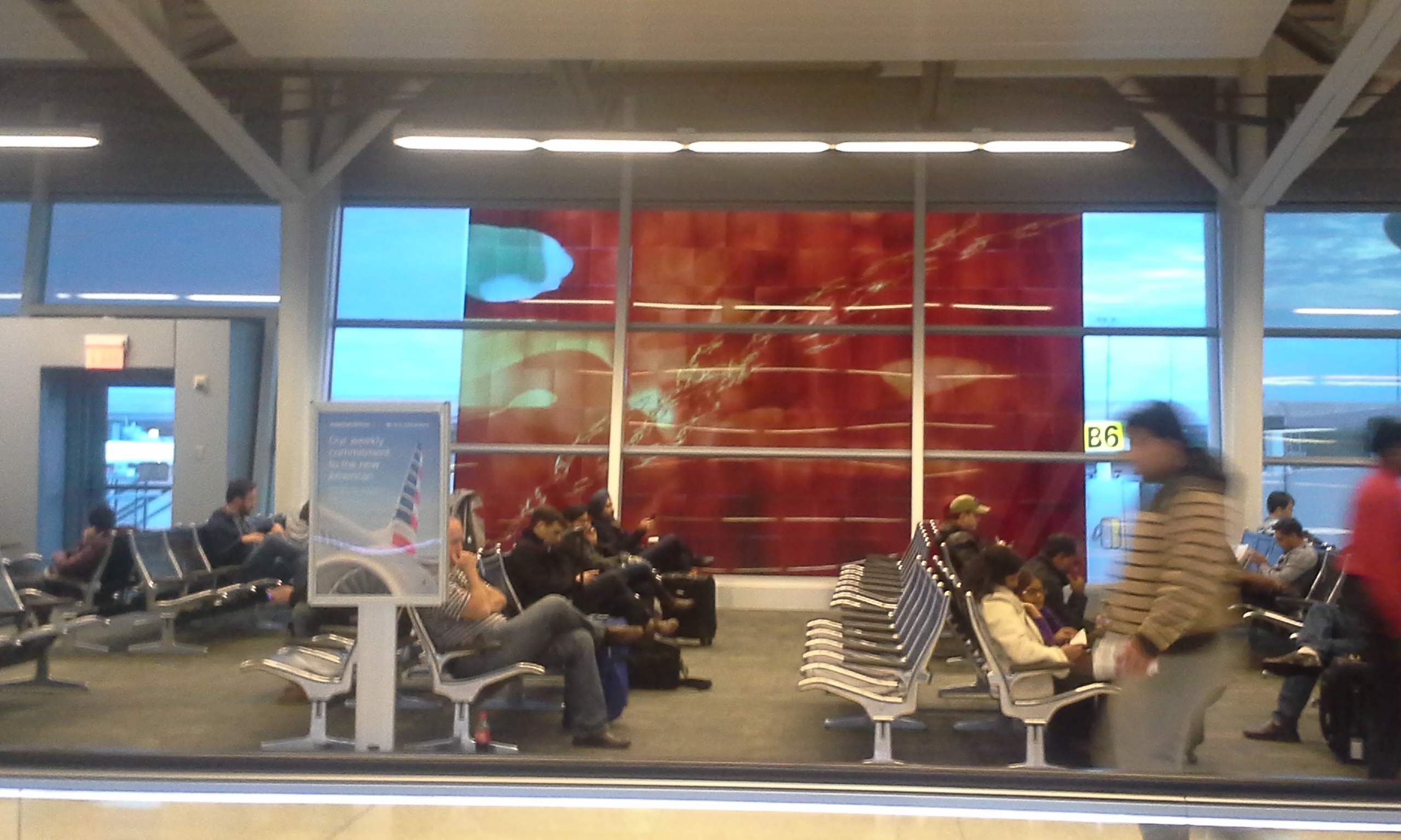
It seems as though the Indianapolis Airport Authority is seeking, often literally, to animate every nook and cranny of its space. Has the leadership become so cynical about the initial commitments that it is willing to reduce every usable surface into a commodity? It doesn’t take much more effort empirically to surmise an answer. Notice the appearance of the gates 1 through 5 in Concourse B (the photo is too blurry, like so many, but you still cat get the idea).

Another view captures it perfectly.

This section of the airport is empty; it’s completely unused. It’s hardly going out on a limb to deduce that many airports have struggled to keep up revenues in the wake of rampant consolidation in the airline industry. While the biggest international powerhouses (O’Hare, LaGuardia, Reagan, LAX) have persevered reasonably well, others have not—even as they remain regionally important hubs.  I’ve noted this in the past on my blog American Dirt, observing the cavernous terminal at Cleveland-Hopkins International (CLE) as well all the extra space at the various check-in gates at IND, here on Urban Indy. A Planetizen article notes the struggles of St. Louis, Cincinnati and Pittsburgh—all much larger airports than Indianapolis—have persisted for several years, to the point that Cincinnati/Northern Kentucky (CVG) may have to demolish a completely unused terminal…or two.
The leadership at IND seems to be deploying ad space as its golden goose. This is hardly unique, since virtually all airports across the globe line their concourses with ads. Bearing in mind all the challenges that airports have faced, one is impelled to be a bit more sympathetic to the perceived “sell-out†gestures with Chrysalis, as well as the monetization of any surface big enough for an ad. Design and finance of the structure took place at a time when twice as many airlines were operating as there are today; the size of the terminal anticipated growth in passengers, not a steady retraction. After all, the above photos all come from Thanksgiving weekend 2014; not one of them evokes the peak of travel season. The airport is never really crowded. Some of the larger airports have it worse: CVG’s entirely vacant terminals, eerily captured at Queen City Discovery, evoke the countless online chronicles of dead or dying malls.
And that analogy may reveal why IND won’t always be able to depend on leasing its space for commercial ventures. At this point, the Indianapolis terminal does not seem to have much difficulty finding either retail tenants or companies seeking the walls for promotion. But since the Colonel H. Weir Cook Terminal opened in 2008, leadership has touted its ability to recruit and retain a local presence: the vast majority of the restaurants and vendors are Indy-based establishments. While this is terrific for boosterism, it may also augur the terminal’s inability to attract big-name national tenants: like a struggling mall, the American Eagle and Talbots don’t perceive enough foot traffic to maintain a presence at “Class B†malls anymore; by that same token, IND saw the national restaurant chain T.G.I. Friday’s depart one of the concourses after just a few years. What will happen if foot traffic is so low that companies don’t even want to advertise? The fact that the Authority is leasing ad space to Enroute Spa when the physical storefront of Enroute Spa is just 20 feet away suggests that the ad space isn’t exactly coming at a high premium. I, personally, would love to see more strict enforcement of the airport’s innovative campus-wide smoking policy. Signs are everywhere at the passenger drop-off points immediately outside the terminal, prohibiting smoking even in the outdoor spaces, with promises of a $100 fine for those who ignore it. Loudspeakers regularly announce this rule as well. But nobody ever enforces this policy, so the smokers get away with breaking a fundamental rule. While I have no idea if enforcement would promise much new revenue (after all, over time people would get the message and violators would be few and far between), at this point the Airport Authority is completely shutting itself out of this revenue stream, while neglecting one of its own policies.
In the meantime, IND must seek innovative ways to generate enough cash flow to maintain operations. Therefore, since local businesses are clearly hungry to promote themselves, why not triple the quantity of advertising messages? Thus, we get that huge video wall while taking the escalators down to baggage claim:
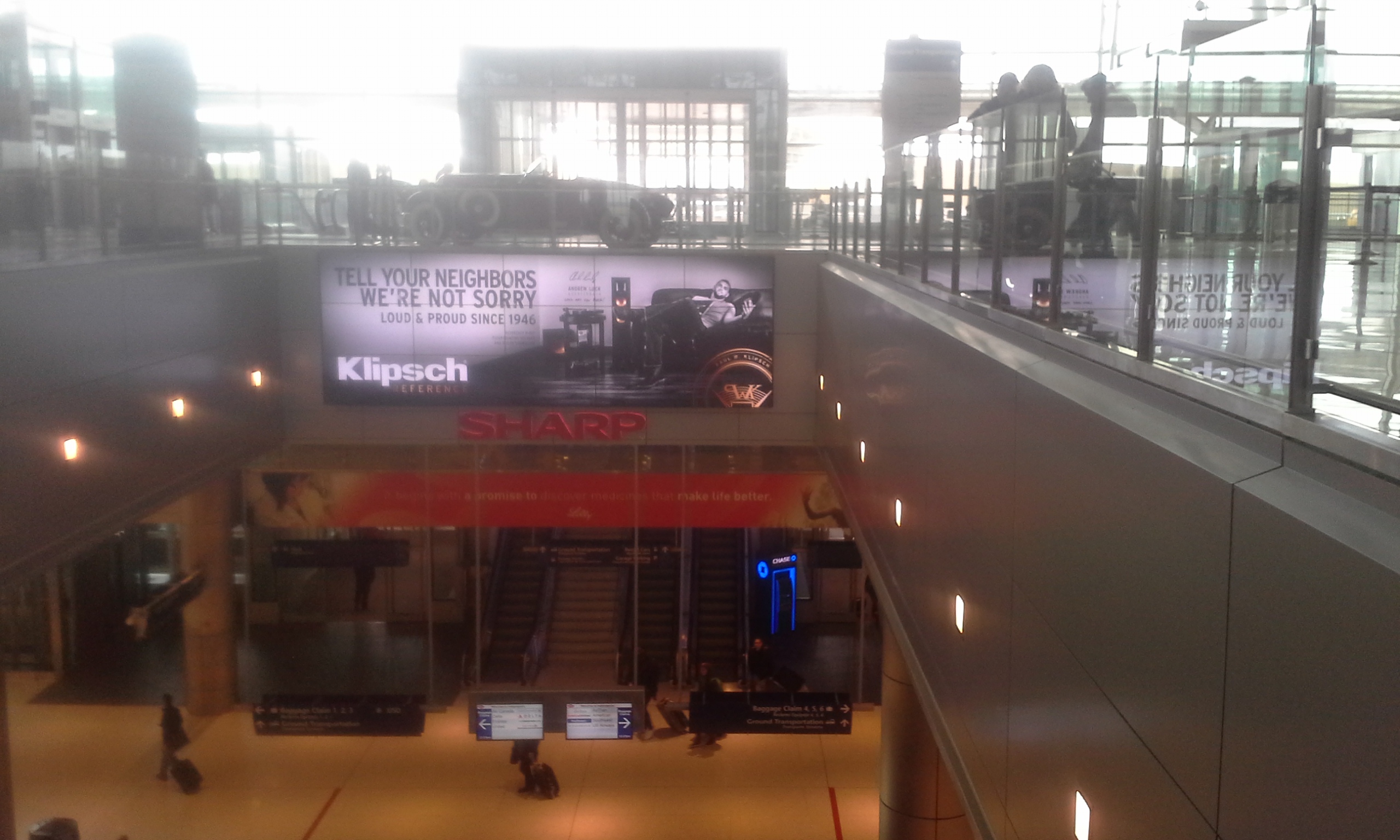
It busily cycles through a variety of advertisements, allowing at least three different companies to market their services over the duration of the one minute that it takes to descend.

But what about the space for video art? The representation of local artists like Artur Silva? As recently as 2013, it was clear that the Authority was dedicating part of the screen to artistic displays. But, as of this November, it only takes about 90 second to complete a full cycle. And 100% of the sequence goes to advertising. Maybe all that will change…when Americans start flying again at the same volume as in the past. Or if.
Maybe I’m lucky, but I’m nearly 100% oblivious to ads. Honestly, before reading this article, if you had asked me how many ads there were at the airport (I was just there Monday night), I would have answered an unsure “none.”
Personally, even though there are a few gates that are empty, I always feel like IND is right-sized. It can accommodate race weekend and the Super Bowl thanks to wide walkways and well laid out concourses, but doesn’t have an entire wing empty like other places you mention.
It will be interesting to see what happens to flying as a mode of travel while oil is $50/barrel and what happens over the next few years/decades when oil climbs back up.
No offense but you take up a lot of space to make a pretty simple point: the airport authority increasingly relies on ad spaces to generate revenue. That’s been going on for years and isn’t likely to change.
After reading this…I sort of asked myself, “where are all of these ads?” I guess I don’t see certain things. And after all…it’s an airport, not the IMA.
Thank you for your comments. Ahow628 and Micah, your observations the unobtrusiveness of this ad-saturation demonstrates that its almost a “boiling frog” scenario: except for the high-profile decommissioning of Chrysalis, the introduction of increasingly more space for advertisements has been gradual and has gone mostly unnoticed. Initially touted for its significant integration of public art, the Indianapolis International Airport now devotes far more of its walls and overhangs to advertisements…which really just makes it in keeping with practically every other airport out there. I, too, am grateful we haven’t had to close any concourses or terminals due to declining patronage. Let’s hope it remains that way.
Although the adverts probably bring in some much needed income, they look awkward, out of place, and over done. I think most ppl who notice just shake their head and walk past. As for the built space, it was built in mind to be calming for a large number of passengers, including those waiting for a transfer (remember the ATA hub). decrease the passenger count and it turns in to a less than calm, even sleepy environment.
Hopefully business will pick up this year as the airport is paying down the cost of the terminal and airlines are subject to less costly leases. I wouldn’t be surprised if the lease deal makes the difference for new flights from southwest, Alaskan air, AA…RE the BA flight to LHR – Indy seems to have a leg up in the numbers game between the midwestern airports; Stl, Cle, Bna, Cmh, based and the local demand, gdp, and business connections. That would be a big score for the city and economy if we could even land 2 to 3 times weekly flight.
I don’t care for the ads above the official airport signage. The fonts on those signs are too small to begin with and this muddies that even more. It’s unfortunate that the Chrysalis art was removed.